
Remote+ is a mobile app that aims to make the e-learning pre-class experience faster, easier, and more fun for the international graduate student populations at the University of Toronto by allowing students to join meetings with one click and to engage with classmates through virtual party lounges.
Watch Video >>
UofT’s Innovation Hub

User Research, Data Analysis, Prototyping, Usability Testing, Visual Design

Desktop, Tablet, Mobile
Students are losing e-learning motivation because they lack of efficient methods to manage and enjoy school life remotely.


We conducted surveys, interviews, and online research to reveal the problem areas of our targeted audiences - University of Toronto students who are taking remote classes. We recruited 37 participants to survey and 11 to interview. Pre-screening criteria are set to pre-filter results. Based on the interview result, we found that:
From the 11 participants interviewed, we created an affinity diagram to gather key insights and summarize three main issues:

We then conducted a research analysis sprint to develop our user empathy journey map.
Based on the survey and interview results, we summarized participants' identities and made them into a representative persona, Sandy Lopez.

We summarized participants' words, behaviours, thoughts and feelings into an empathy map.

We described Sandy's journey to access a remote course using existing processes (e.g., through Quercus, Acorn, and other UofT's online teaching platforms).

Finally, we concluded 5 Sandy's needs

We brainstormed 12 big ideas and narrowed them down to the top 5 that best target Sandy's major pain points of accessing remote classrooms, with respect to the user journey shown in the as-is scenario.

We envisioned Sandy's future journey of accessing remote classes if these top concepts were to be implemented and concluded on the following to-be scenario.

To conceptualize our ideas, we first drafted low fidelity sketches, which were then turned into a clickable medium fidelity prototype
View Storyboard >>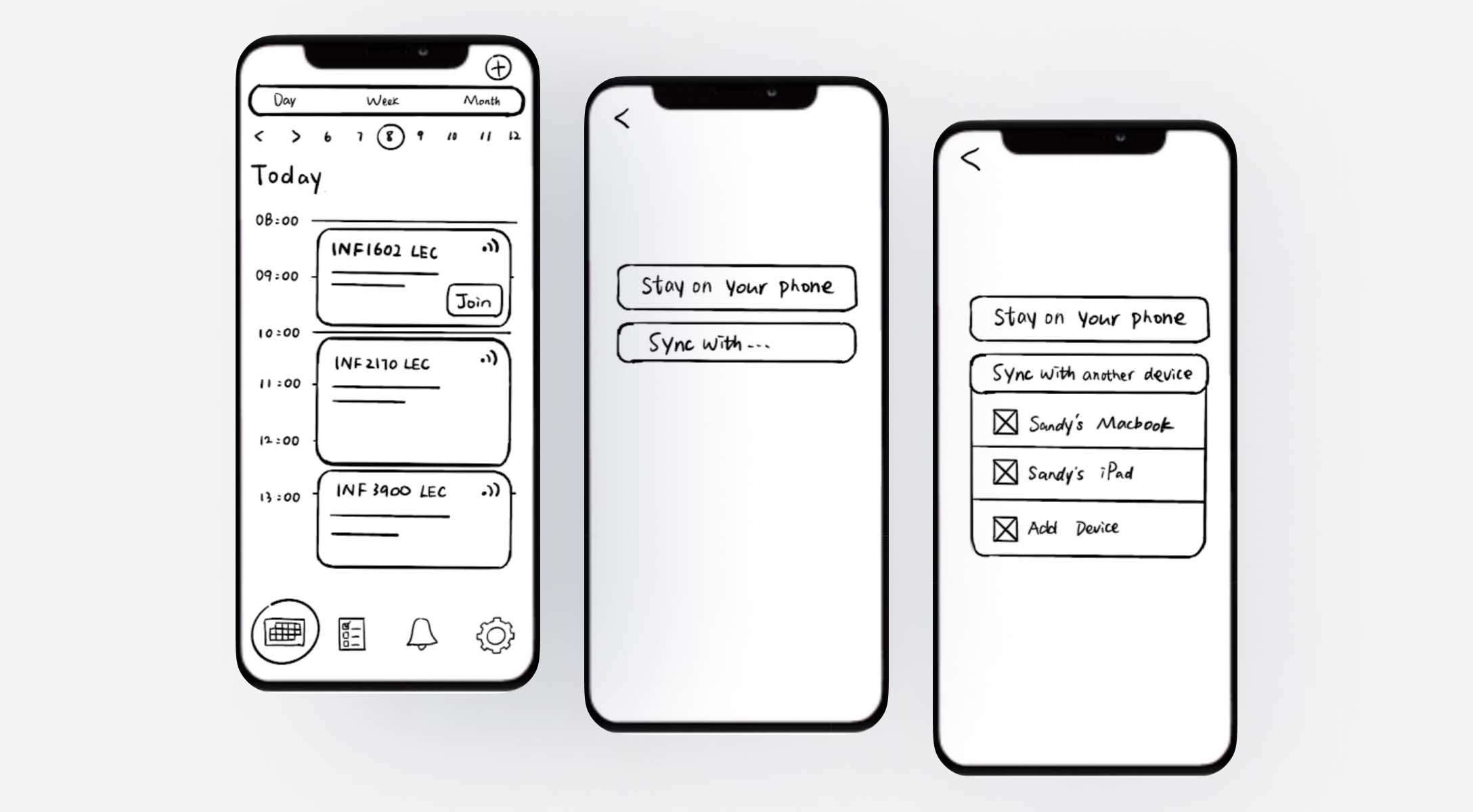
When we turned the sketches into medium fidelity prototype, we made a couple of changes to the process of onboarding, joining meetings, and waiting such that:

1) users receive more validations when the initial setup is completed
2) users are directed to waiting rooms and are asked about device preferences at the end of the workflow
3) users have access to party lounges, which include chat rooms and mini-games
4) users have clearly labelled tab bar navigations for home, notifications, and settings


When our mid-fidelity prototype was sufficient for testing, we invited four people to participate in our remote moderated usability test, where they completed tasks based on scenarios we formulated.

Log in to the app, set up reminders, and device synchronization
Check timetable and join the upcoming class
Join a conversation on basketball and play a round of chess with classmates in the waiting room
Check class announcements via push notifications
With the user feedback, we were able to modify the interface to address issues.
Tutorials to guide new users
Calendar time indicators to clarify displayed time for out-of-province users
More gamified and socialized party lounges
Customizable reminder.
Although having brilliant ideas is crucial to a product's success, building a product that targets users' major pain points is what will speak to the audiences the most; therefore, it is sometimes necessary to let go of ideas.
Visual designs and color choices play a big role in guiding users and as well as telling stories.
A product is never truly completed and there are also next steps to consider.