
Shein is a global B2C fast fashion e-commerce company. In order to generate more profits for SHEIN by improving the existing site, an in-person moderated usability test session of the Shein website (www.shein.com) was conducted with the primary target users—Gen Z customers—at the University of Toronto in Canada.

Shein

Test Facilitator, Analyst, Observer

Ruhan Pan, Humphrey Zhang, Yvonne Zhan


Whether users can navigate the website in an efficient way?
Whether users can find a desired product with the current filter tool?
Whether users can choose the right size based on the current size guides?
Is there any friction in users’ checkout paths?
Primary: Gen Z customers, mostly women
Secondary: parents of children from 1 to 15 years old
Session Type: moderated & in-person
Location: University of Toronto
Duration: 60 Minutes
Incentives: none
Devices: a laptop with a touchpad (no external keyboard or mouse)
Recording Method: screen recording via Zoom.
Video recording feed to analyst and observers
Informal recruiting from UofT email, social media
12 participants
3 floaters
Screeners fit the appropriate target profile for the qualitative research (including age, gender, behaviors, purchasing habits, etc.)
We created an affinity diagram to organize a large number of findings into their natural relationships. We used both top-down and bottom-up approaches to ensure that we uncovered issues by objectives.
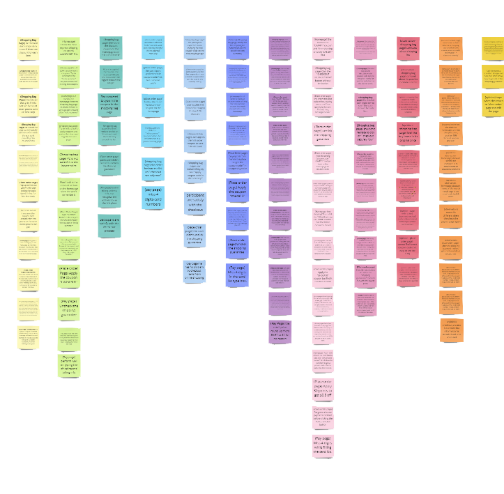
According to the issue's frequency, persistence, and the impact the issues may have on the user's efficiency and ability to complete the task, a severity rating was assigned to each problem in the following:
Users may find challenging to overcome and affects general usability or the user’s overall impression of the website. Fixing such an issue should be given low priority for the next release.
Usually won’t stop the user from finishing the task but will have to undertake some of their moderate effort in getting around. The issue is essential to fix, and it should be given high priority.
Seriously impairs the use of the product. Users are unable or unwilling to finish their tasks. The issue must be fixed before the next release.
Too much information and abuse of flash create a cognitive overload for participants, discourage usability and distract attention from the site's core value.
The labels are overwhelming and inconsistent in granularity, confusing when users find information.
The navigation bar cannot be fixed in position while scrolling, making users go back and forth while browsing products.
There wasn’t a warning message when participants imputed a card number with more digits. The same issue happens in entering a zip code without typing space in between.
The lack of a visual hierarchy in the navigation bar and breadcrumbs made it difficult to find the information.
The shipping guarantee fee is default checked and is small in visuals. It cannot be deselected once participants leave the page and return.
Most labels are too long and at varying levels of granularity, causing participants to struggle with finding a product.
The Place Order Page is not where participants expect to enter their coupons.
The Pay Page is not where participants expect to enter billing information.
There are too many size guides, including product measurements, body measurements, model dimensions, and customer evaluations, resulting in excessive time spent on finding a size.
The unclear use of free shipping and free express shipping confused participants.
Finally, we shared the usability tests’ findings with relevant stakeholders across our team, to earn buy-in to proceed with our suggested improvements.
View Full Report >>A list of pre-prepared questions will help significantly when it comes time to sit down and run your usability testing sessions. But while a list is essential, sometimes it can also pay to ‘follow your nose’ and steer the conversation in a (potentially) more fruitful direction.
Ask users to articulate their thoughts as they proceed. Even if they make the “right” selections, it can be very instructive to hear why they made that decision, as well as how they respond and feel throughout the process.
Keep a poker face. Make sure your responses to questions or reactions are neutral. You’re not looking to hint, influence, or otherwise direct the user. You’re looking to get honest feedback.